Minimal example for the development of a data science product
Developing a data science product is the focus of many startups and enterprises in our time. Thousands of entrepreneurs are working on finding a way to create a better world or to make huge money. They all want to do this by using current developments in machine learning, data storage, cloud computing, and deep learning. Although many products are built on technology, data-driven products are unique since here the research results of last week may end up in a product already next month. And that is fast. The field is, therefore, filled with noise and buzz…
Here, I would like to share a short tutorial on the development steps of a data-driven product. I will use the example of the Christmas Card I made for this year’s holiday season and that I sent on 21 Dec to my colleagues and collaborators. The experiences I’m about to share are coming my day to day work as R&D Lead next to a brilliant businessman and a lean development guru.
Think twice
All product development should start with a small brainstorming. In this specific case, since I was the only one who was working on the project I had to discuss my idea with others who were not directly involved. To this aim, I took the sketch of my idea and pitched it to as many people as possible. I wanted to deliver a warm Christmas message that reminds people of others ( value ). I had a deadline: I wanted to be ready with the card/visualization by 19 Dec in order to write some notes and make sure that everyone gets the message before Christmas (last deadline was 22 Dec). I like time pressure factors like this, they help concentrating on delivering value for the customer instead of crafting for perfection in a never-ending cycle. Since I had my daily job, research, friends etc. in my life besides this pet project, I had to make sure that I reduced wasted time and resources(e.g. implementing features that will never be used). Finally, because after all this is a Christmas card that people are going to look at and archive/delete from their mailbox, the message had to be clear and concise. To warrant this I created several iterations and measured their effectiveness before working on the next phase.
Theory and practice
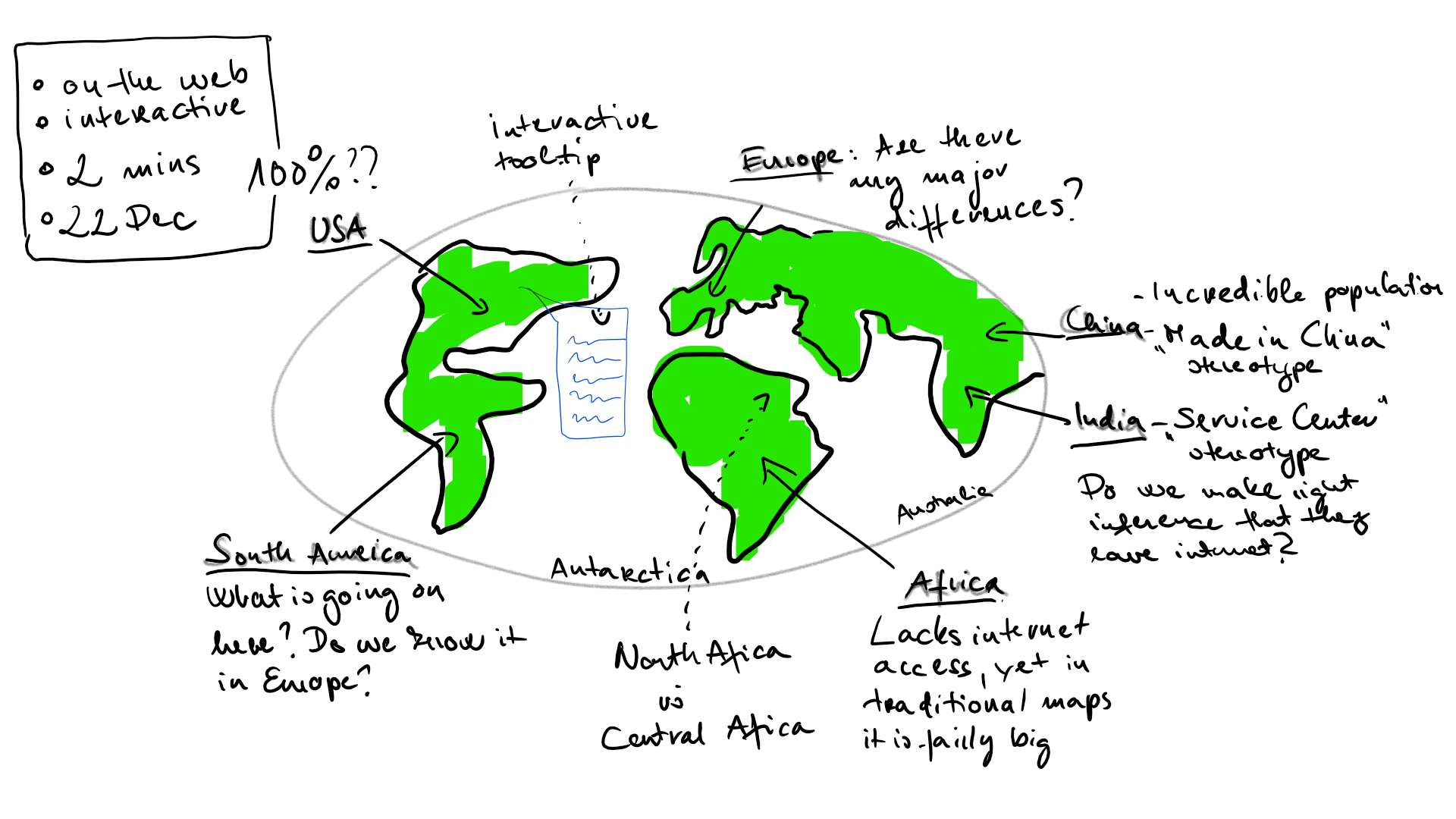
My idea was an interactive map, which used a heatmap to show the population of a country and opacity to visualize the internet penetration. This way people become ‘invisible’ where the internet was lacking, yet you were able to see the population based on the color. Initially, the interactivity was a tooltip function which mined a recent article about the country in question and showed it on hover. I also wanted to put some machine learning at work inside the thing to turn it into a real data science product, but at the beginning, I was not sure where to put it or even more: where would it be useful. In sum, I imagined something like this image here:
I spent some time also on how I want to create this visualization. When developing a data-driven product it is tempting to move at full speed and just crunch the numbers and write hundreds of lines of code. This happens because it is rewarding to see how the product changes with every press of the enter button. But there is always an end to every work day, a weekend, or another project which halts the flow. So you should always keep in mind the mantras of:
- Documentation
- Version Control
- Containerization
I followed this, so the code with the Docker container is available on GitHub
First step: the Proof of Concept
Actually, this should be the proof_s_ of concept as there may be multiple sides where your idea should be tested. Here, I limited these to only two sides: technical and storytelling. Firstly, before start working on a project one has to take into account what tools are available, what developments are yet to be done, and what are the foreseeable risks that you are taking (something is doable in theory, but what if it turns to be not working in practice… ). In this case, I needed some kind of visualization library, that:
- has a Python API. Because I worked in Python most of the times in December I did not want the friction of changing to R or Javascript when I steal 5 minutes to work on this. In real projects, this is also an important consideration. Do you want to have multiple languages in the codebase? Do you have the people to maintain it? Of course, the situation is not black and white, yet you have to think about these.
- would run online. ggplot2 is an excellent library but its focus is not online visualization so I had to find something else
- is interactive. I did not want to squeeze too many info on the plot but let people to explore the ‘world’ if they were interested
After reviewing some of the available tools (Bokeh, Tableau, Shiny), I settled down with Plotly. Plotly is a nice tool; it has Python at its core and uses the D3.js visualization library, which is one of the most supported and well-known web browser compatible library on the market. I had to make sure that it is able to visualize maps in choropleth form and the answer is yes.
The other side I wanted to verify was the storytelling part. Without an eye-catching story, this is only a nice craftsman work but nothing else. Since I planned this as a nice Christmas message the storytelling part was crucial. The question here was therefore whether it is surprising or poignant to see how the developing world is lagging behind us. I was shocked by the actual numbers, but if you think like a researcher that is only one data point. You cannot build a data-driven product on hunches or subjective feelings of a single person. Therefore, I decided to run a short query with my friends. I’ve created an online survey and asked their opinion about some of the less and some of the more surprising countries internet penetration. Creating a survey is easy, but creating a survey that collects opinions in an unbiased way always requires a little self-reflection. The way you ask a question influences the response. If I ask what did you do last summer, you think I assume that you did some things and you will try to answer what you think makes our conversation the most consistent. After all, a survey is a kind of interpersonal communication.
Here, I used sliders between 0 and 100 and asked people to guess the percentage of people with internet access in 10 countries. Might seem a minor thing, but it matters:
- Whether you give a reference by stating the actual data for one country. That helps people to tune their response, but I was more curious to their uninformed guesses.
- Where you put the default position of the slider. If it is 50 then people will slide from 50 to two directions, which would help me generate a nice Gaussian but at the same time could work as an attractor and I will get less deviation between guesses. If I put 0 though it would mean that they have to make more effort to pull the slider higher. Although in many cases, 0 could be an attractor as well but here, since we are in a culture where basically everyone we know is online, this is unrealistic.
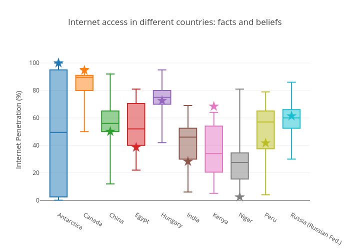
After collecting the data, I’ve run Bayesian t-tests with the test value being the actual value and used a Cauchy prior with half-width .705 (this is more or less standard in the objective Bayesian approach). Let’s see a nice visualization of the difference between what people think and the actual values. Also, because people will make multiple comparisons when looking at the visualization to decide the surprise factor of the countries, I applied Bonferroni correction for the final Bayes factor values.
- Values <3 were interpreted as Expected
- Between 3 and 10 as Somewhat Surprising and
- Above 10 were Very Surprising.
The surveyed countries were Hungary, China, Russia, Canada, India, Kenya, Niger, Egypt, Peru, Antarctica. The figure below shows the real values and the distribution of the data. The guesses for Hungary ($BF_{10}$ = 0.03), China (0.05), Russia (0.03) and Peru (0.10) were as expected. The actual values were somewhat surprising for Egypt (4.66) and India (5.23); and were very surprising for Kenya (~170000), Niger (~4300), Canada (25.29) and Antarctica (635.2). Interestingly the largest surprise factors were for the two African countries, and Kenya was underestimated whereas Niger was overestimated (2.65, error% = 0.002). This is a good sign of our uninformed perception of the continent. A fun fact also: Antarctica… people seemed to be mostly indecisive about its status. So all in all, this data looks very interesting and is predicted to be useful to raise awareness of the developing world’s problems.
Second step: the first iteration
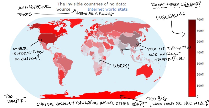
I started to work on the visualization. The first steps were ready relatively simply and I had a visualization which then can be finetuned… except that I had two visualizations, which I thought are great. In one the countries with lack of interest were rendered invisible making a large lake in the middle of Africa, in the other, I inverted the process and they were rendered visible creating islands in the “big data lake of the world”.
I was stuck. I had reasons for one and also for the other. If I used the visualization where these countries are invisible, then I’m using something not visible as a strong visual symbol, which is elegant. In the other, I make a strong reference to the big data jargon. Because I was still interested in delivering a message in very short time I made a second survey with different people. I had no doubts that the target audience can understand both messages, but the question was which one they understand more quickly and more readily. I asked two questions, the first was an open-ended, for that I asked them to give some opinions about what they think is visualized without any explanation. In the second question, I explained the aims and then asked them to decide which one serves the purpose better. This way I was able to get both an informed and an uninformed opinion.
The results were very interesting. A clear majority (72.7%) preferred the invisible version. At the same time, there were some consistent critics from the respondents. First of all, almost everyone expressed the difficulty of interpreting the color scale which seemed to be misleading as population and internet penetration were rendered on the same property. Second, there were some critics regarding the projection used on the maps, which rendered Antarctica huge. Furthermore, I tried to use a rather unorthodox colormap which received also negative feedbacks, as even small populations received vivid colors. This leads to an important lesson: if your product is in a time-sensitive scenario you must compress your information, which can only be done if you are using signs which are already known.
Third step: the next iteration
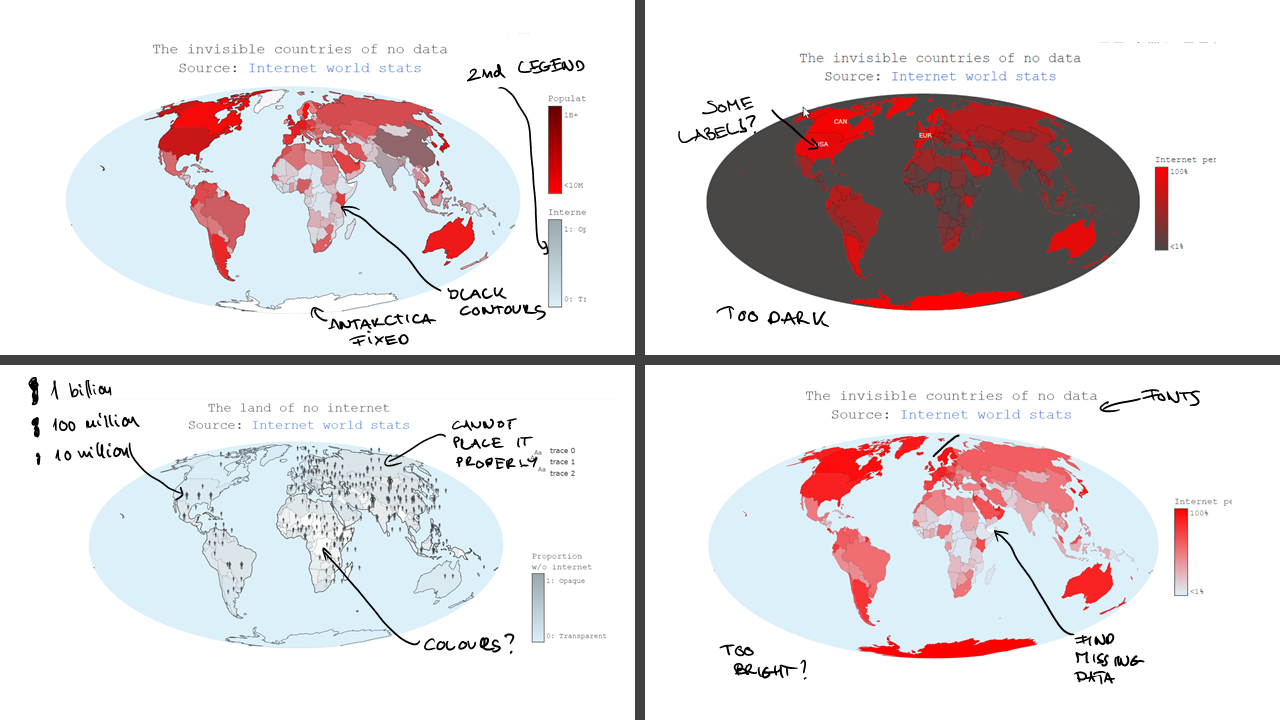
Based on the reviews, I dropped the population visualization and only used the internet penetration data. This step meant that the time I invested in figuring out how I can visualize this two orthogonal dimensions on the r,g,b,a axis in plotly were waste… Had I surveyed a mockup visual with this kind of coloring before I would have avoided working in vain.
For the second iteration, I trusted some of my best peer colleagues whom I bombed with new visualizations (differing sometimes in only a single letter) every evening. This process took 4 days and finally I was ready with a visualization by the evening of 19 Dec. Ready though does not mean I finished implementing every detail. In order to show what I have, I had to stop developing. I did not have time to add a good story for Antarctica, I did not have time to implement the automatic collection of the stories, I did not use CNN as the source of the stories (would have been a funny reference though for the convolutional neural networks :) ) and etc.
Instead, I wrote a short blog post to introduce the visualization: 2 minutes reading time as it was the average time people spent on my webpage last year. Finally, I invested the last day in a very important thing: responsive web design (aka. wrapping the present). I looked at what are the usual devices people use to visit my webpage. 80% of the people used desktop or notebook computers and ~20% used a smartphone to surf my page (no one seemed to use tablets.. ). I expected that because of the holiday rush this number maybe even increase. This meant that my visualization should be compatible with smartphone displays as well. Working this out with Plotly is easy, so I was able to finish everything and send the emails on the morning of 21 Dec.
The end result
For the end result, click here