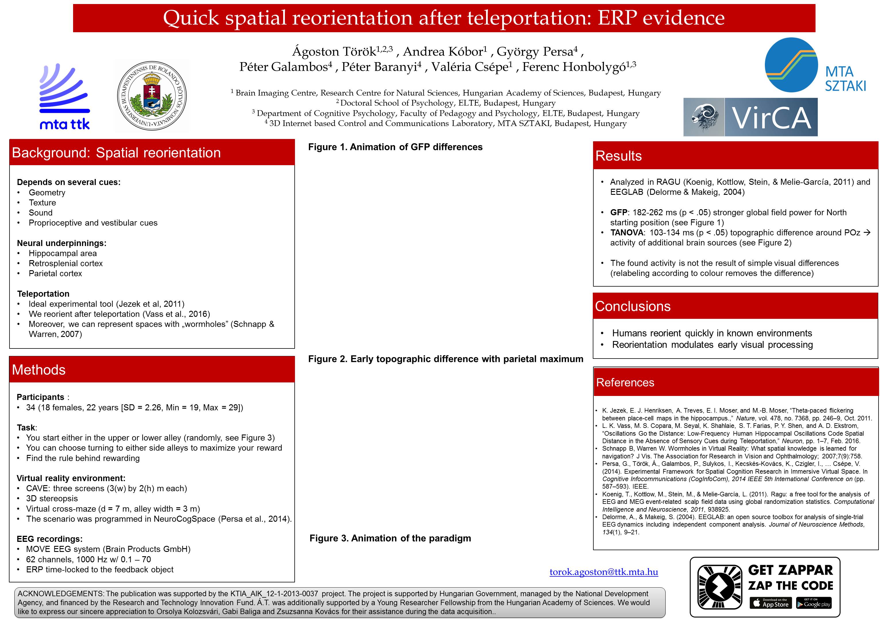
Augmented reality poster 2.0
I’m traveling to Barcelona to visit the ECVP2016, where I continue my mission on AR evangelism. I learnt a couple things from the ICOM6 that made this poster a better shot.
I noticed that some people didn’t know what to do with my poster, they were standing in front of it and did not find its affordance. Also, I was studying which graphical features attracted the most people. Based on this I realized that it was not a good idea to minimize color use on headlines. On this poster, in reaction to these, I changed two things:
- I added red headlines to attract attention to my work.
- I completely removed the figures to facilitate affordance (I bring a version w/ pictures for handouts)
- I added animations instead of static pictures, this way one could understand my results in 15 sec (measured)
Final words:
I brought a surprising and new result to the conference: People reorient very quickly in a known environment (~100 msec), and the unseen spatial information modulates visual processing from early stages. If you read this before, let’s meet at my poster on Monday, if not I hope that the visual effects brought you there and you learnt about a rather interesting part of spatial research. Cheers!
